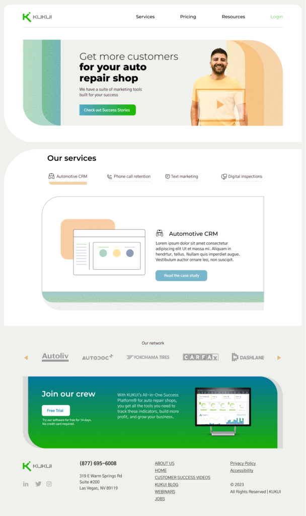
This Website is cluttered and feels unprofessional. There are a few specific things that contribute to this feeling:
- Too many icons. The website has too many icons, with different colors and line weights. This makes it difficult to navigate and can be distracting to users. It feels like there is a lack of organization and consistency.
- Too much text. Possibly it is more a matter of organizing the text, including the headings better. In a few cases the text is on top of an image, causing clarity issues.
- Poor use of white space. Inconsistent spacing, padding, and using overlay background images make this website look busy and overwhelming.
- An overloaded Header. With too many options the header is not easy to focus, taking users’ attention away from their intended goal or the desired user journey.
These factors are likely giving users a bad experience, relying more on the back button, abandoning the Website or trying another method to get the information they are seeking. Now let’s look at some solutions to address a cluttered Website.
- Reducing the number of elements on each page. This means removing unnecessary text, images, and overall choices. I’m going to simplify the navigation. Using fewer elements on the page, will help it feel a lot less cluttered.
- Use whitespace effectively. Adding more whitespace between elements on the page will help to create a sense of order and make the website look more visually appealing.
- Use typography effectively. The right typeface can make a big difference in the overall look and feel of your website. Adjusting the hierarchy of the headings will increase ease of scanning.
- Use color sparingly. Too much color can be overwhelming and distracting. I think the solution here will be to eliminate some colors so there is a simplified color palette, and use the strong color choices on branding and directing the user.
- Use images strategically. Images can be a great way to break up text and add visual interest to your website. However, certain images look outdated and are used as overly background images for no reason. The icons as mentioned need to be evaluated as to their purpose. I will use images sparingly and make sure they are relevant and in harmony with the brand.
Following this recipe should lead to a much clearer, professional and engaging Website for this business. Delighting users instead of confusing or frustrating them.
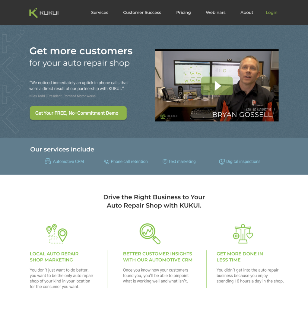
Here is another attempt at a redesign. I really went something completely different than the original and applied the same UI cues as outlined above. Although not part of the initial review, the logo is bananas and I just had to create a simplified version. LMK if you dig it.