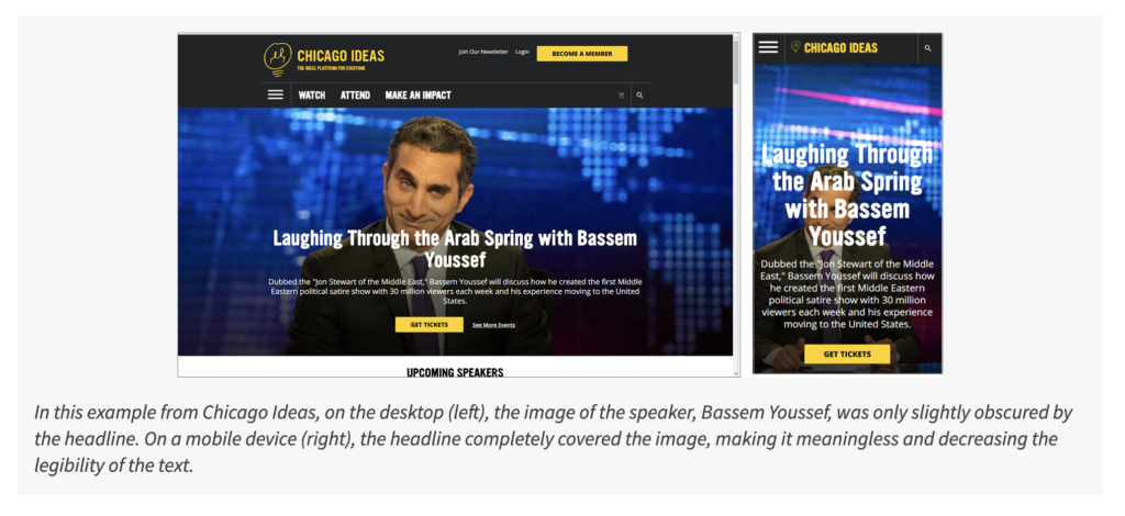
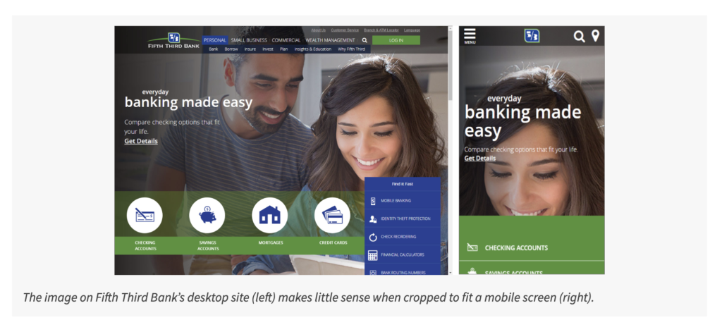
Let's look at websites suffering from oddly cropped images busy heroes, accessibility issues and more.
Intro
In this article I am diving into a clarity issue in visual design surrounding Website Hero’s. Often this problem occurs when viewing a Website that was designed for a large screen and when viewed on a mobile device the proportions go out of whack. I reference an article on the Nielsen Norman Group (Schade, 2018) covering the topic in detail. I found 2 Websites that currently have this issue and redesigned the hero to show a possible solution to the design problem.
More Details
I took this summary from the NNG article:
"When using large-screen images on smaller screens, remove images that don’t add information. Then, pay close attention to cropping, scaling and placement."
In essence this was my goal with the redesign of these 2 Websites. But specifically I looked at two of the issues brought up. 1. Clarity of Image and Legibility of Overlay Text. 2. Poor Cropping or Scaling.
An example has image cropping - Credit NNGroup
An example has image cropping - Credit NNGroup
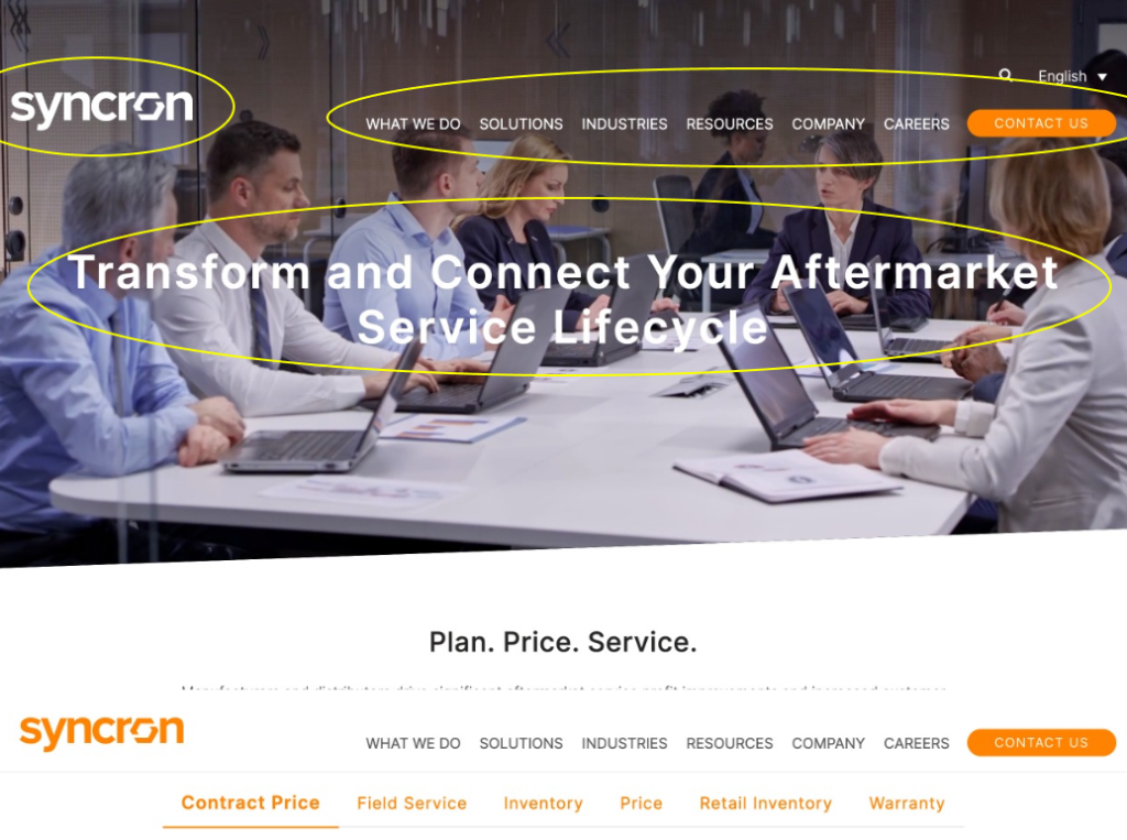
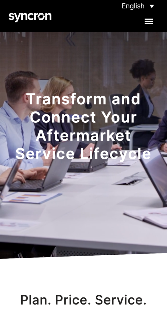
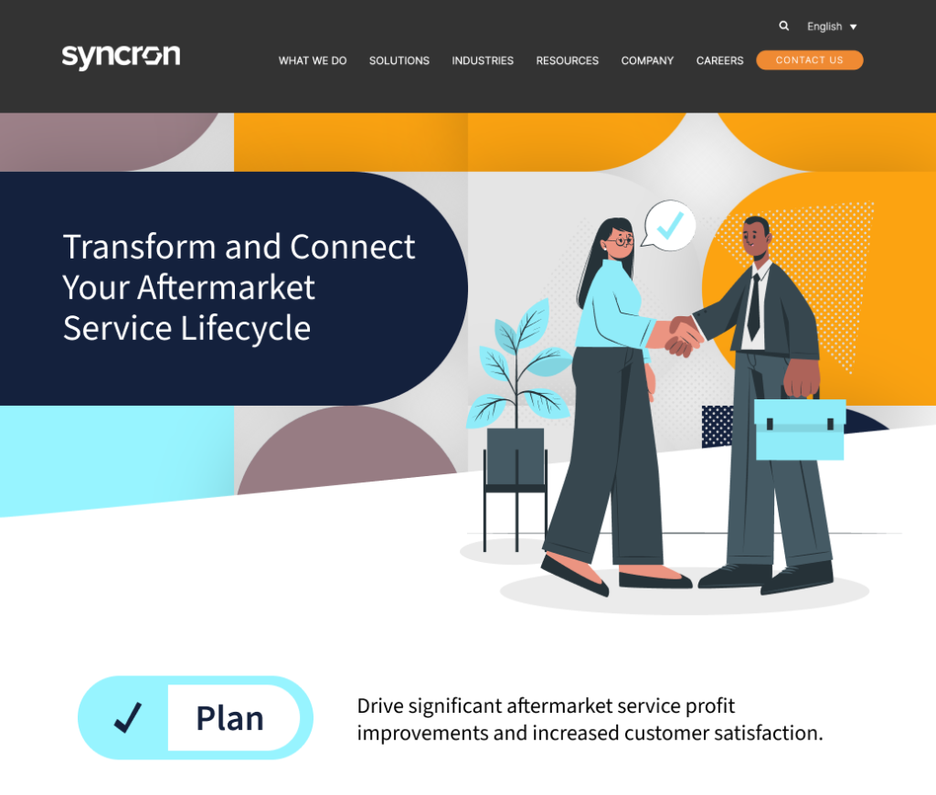
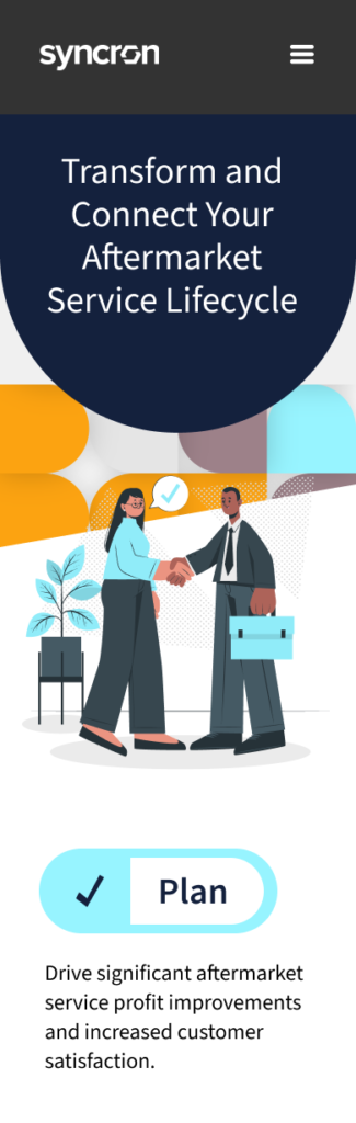
Example 1 – www.syncron.com – Issues
Legibility is a definite issue, with a busy background video and white text, this hero is distracting and difficult to read, especially when viewed on mobile. Even the top level menu items can be hard to read. They did try to make it more legible by adding a dark gradient overlay from the top of the screen but it is not quite enough.
Before: This Desktop example has overlay text- Credit syncron.com
Before: This Mobile example has overlay text- Credit syncron.com
Example 1 – www.syncron.com – Solution
After: This Desktop design is so much more legible
After: Mobile design
After: Much happier and well designed
To begin with I added a dark gray background behind the navigation. I believe that white text on a dark gray is better on the eyes than solid black (Anthony, 2018) This really helps separate the Header from the Hero section. Next I found a background pattern to put behind the hero text and image. This was found and modified to match the Company’s branding. Though I used a less saturated Orange. I strived to keep a simple and sensible color palette. I extended one of the shapes in the background and placed it behind the Headline. This gives a solid base for legibility. One thought I had while putting this design together is it could be fun to play with the “O” in the Syncron logotype as a shape to inject throughout the design and even branding.
I decided to ditch the whole video background for a couple of reasons. First it is very “stock photography” and does very little to help the brand. Second, the video is just too distracting from the main message. I found a very fun and applicable illustration and recolored it to match the branding in the design. I used the image to cross the section divide, this can encourage scrolling and exploration to the next section. One thing missing from the Syncron hero is a CTA. I did not add one in the design but would highly recommend that one be considered.
I played slightly with a secondary section and how I might add some visual interest to what is currently just text. Turning to the mobile design I first expanded the header so there is more breathing room and room for my thumb. I used a dark gray background color as mentioned before. Most notably I changed the rotation of the Headline background to give more encouragement to continue exploration. The image is dropped below that and I scaled the background image to an appropriate size for mobile. I would also simplify the text on mobile for any lengthy descriptions, as people scan vs. read. I think that I have a nice start to a design solution, no more legibility issues.
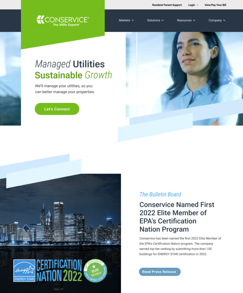
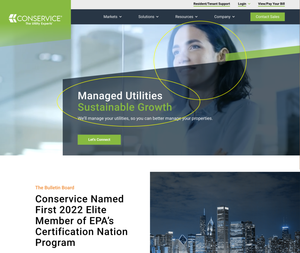
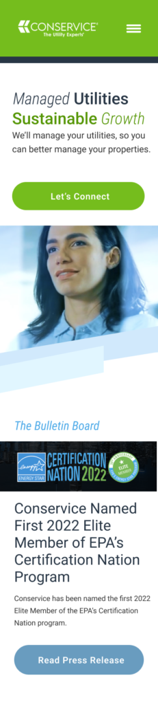
Example 2 – www.conservice.com – Issues
With this site the issues are again a busy video background that autoplays. The clarity of the imager with all the business going on, the busy shapes, competing colors and the questionable accessibility of the headline. Lastly in mobile the cropping of the image.
Before: This Desktop example shows clarity of image issues- Credit conservice.com
Before: This Mobile example has cropping issues- Credit conservice.com...
Example 2 – www.conservice.com – Solution
After: This Desktop design is so much more legible
After: Mobile design
After: Much happier and well designed
The first thing I wanted to do was make the shape behind the logo solid, vs. the muted fading gradient on the current site. This possibly says this company sits on a solid foundation. I next gave the navigation some extra padding as it felt crowded. I then placed a white background behind the hero content to make the text legible and accessible. That dark green text on top of a dark blue just was not working. I also tried playing with the fonts in the headline, adding different weights brings in some visual interest. and since it is only four words I think I could possibly get away with throwing in slight italics as well, but I understand some may think it is a bit too much. I wanted to retain something from the current background video so I took a still shot and placed that in the background. I do like the short and sweet secondary text, seems to be the right amount of info a user might actually read.
For the CTA I made it much larger and pill shaped. In concert with removing unnecessary green in the customer links and changing the green angled shape to blue really helps the CTA stand out. The angled shapes I thought were a perfect tool to connect the sections and encourage continued engagement. With the secondary section the first thing I did was swap the columns so the image is on the left and text on the right. This is more of a natural way that we read in the West and aligns with familiar patterns.
Another liberty I took was removing the “Contact Sales” from the navigation. I felt it was competing with the hero CTA and if really needed could possibly come back once a user scrolls and the nav section changes state as is quite common. Going back to the second section I matched fonts in the headlines and ditched the random orange in the pre title. I’m not sure why green, blue and orange seem to come up so often as color schemes. Color is for another topic, but let’s just not put a bright orange and a bright green in competition with each other. On the secondary button I dropped the size and changed the color. This makes the secondary button secondary, even though these two buttons may not be on the screen at the same time on a large screen.
With the mobile layout I adjusted the header to be solid green with the logo and menu. I added a navy blue bar to separate the header from the content. I pretty much copied the hero content and adjusted the CTA to be a full-width button. I then added the image underneath and viola no more odd cropping or legibility issues! Lastly I went for ditching the secondary section’s image of the cityscape as it really is not needed, and I allowed the secondary button on mobile to be the same size as the main button, being that they won’t be seen on the same screen and mobile has different usability to consider. Now the hero elements play so much nicer together.
Conclusion
To wrap up here it takes some time and consideration when planing any part of a Website. The visuals will definitely tell a message, either it will be clear or not. And if it is not clear then how does that reflect on your company and brand? Even modest updates can do a World of good for your users experience. Thoughtful color, text and image choices can really help communicate your brands message clearly and effectively.
In my solutions I of course did not do any user research, I have no knowledge of user personas or business goals for these two Website. But I feel my expertise and knowledge of best practices are legitimate to my design solutions provided.
References
Schade, A. (2017, May 21) Big Pictures on Small Screens: Remove, Resize or Reorganize. Nielsen Norman Grouphttps://www.nngroup.com/articles/big-pictures-small-screens/ Anthony (2018, May 8) Why You Should Never Use Pure Black for Text or Backgrounds. UXmovement. https://uxmovement.com/content/why-you-should-never-use-pure-black-for-text-or-backgrounds/
You work hard for Website traffic, so don’t waste it. If your site is cluttered it will be difficult to use and navigate. And users will quickly give up and leave.