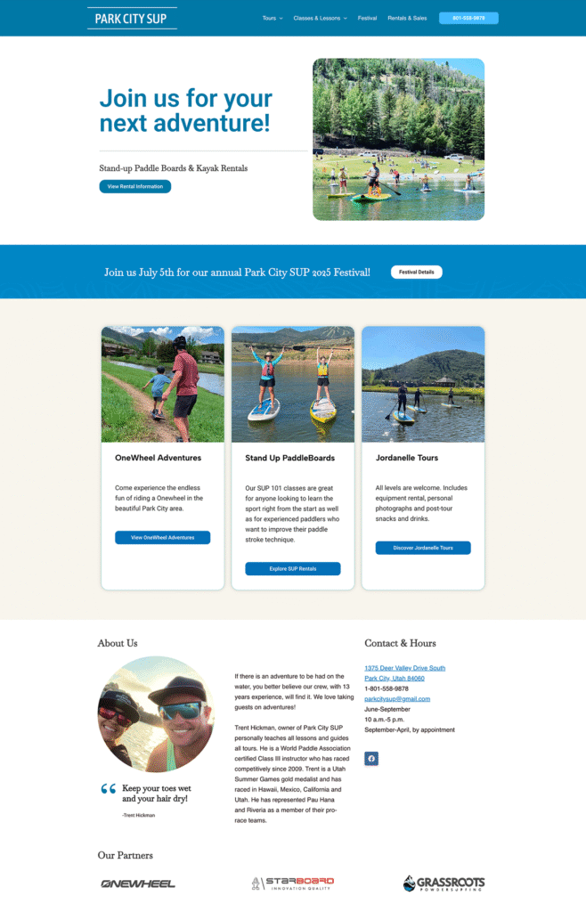
Park City SUP cliental are outdoor enthusiasts and those interested in stand-up paddle boarding classes . The Website needed to be playful, engaging and easy to use. I developed a bright color palette and used large images of people enjoying the sports in order to create a sense of excitement and adventure.
Goals
The Park City SUP has two key goals in mind:
Enhance Brand Image: Project a playful, engaging, and adventurous brand image that resonates with Park City SUP’s target audience of outdoor enthusiasts.
Increase Bookings: Convert website visitors into paying customers by encouraging them to sign up for stand-up paddle boarding (SUP) classes or rentals.
PCSUP Home Page
Key Design Updates
A fresh look:
The previous website used a combination of:
Muted backgrounds: These backgrounds unfortunately dimmed the vibrancy of the exciting photos.
Clashing neons: The overly bright neon colors lacked harmony and created a visually jarring experience.
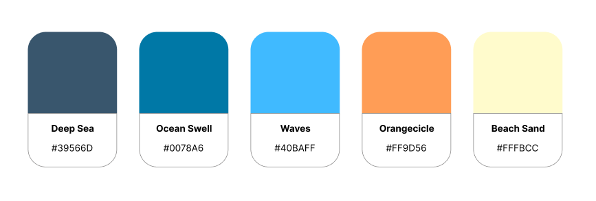
A New color palette that:
The photos now allow their energy and beauty to shine.
A cohesive feel: The color palette uses a harmonious blend of cool colors and two complimentary warm colors that are visually engaging.
Color Palette
Results
The website redesign has led to a significant increase in user engagement:
Time on Page: Users are spending considerably more time on the site, with average time on page jumping by 14% (from 2 to 2.23 views per user).
Rentals Page Views Up 168%: The Rentals page has seen a dramatic increase in views, surging from 172 to 462 in just 30 days.
Summer Camps Capture Attention: Summer camp views have skyrocketed by 232%, growing from 58 to 193 views.