About Glen Gunnell
When I began creating websites, I enjoyed the power of manipulating pixels in Photoshop. Back then, design was all about what I thought looked good. However, everything changed when I discovered the craft of user experience (UX). My graphic design roots provided a solid visual foundation, but web design ignited my curiosity about user behavior. I started exploring interactive elements, considering not just their engagement factor, but also the psychology behind how people navigate a website.
One project, for example, involved a lengthy form that discouraged users from completing their request. By implementing user-centered design principles and data-driven decisions, we transformed it into a short and intuitive process. The positive user interaction resulted in a 62% increase in form completions.
Now, I’m on a path of exploring website strategy, embracing the holistic view of the website experience. This is a thrilling career progression, allowing me to combine my design sensibilities with UX expertise. My goal is to craft websites that are not just visually appealing, but strategically designed to achieve business objectives.
If you’re looking for a creative problem-solver passionate about crafting user-centered websites, let’s chat!

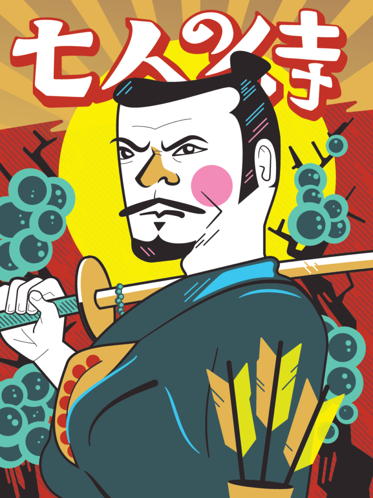
Illustration
I also have a passion for drawing and illustrating. Here are a few of my pieces.


