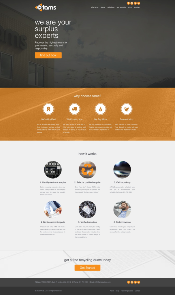
This website is very likely giving users a bad experience. The hero section reads unclear about what the company does, and the layout is odd, like something is missing. The overlay background images are an outdated look and do not communicate anything. The icons throughout the website do not match and look like stock icons/photos. The “How it Works” section could be more engaging, such as with a video or interaction. The body text is small and difficult to read. The final CTA could be more specific, such as “Get a free recycling quote today.”
TL/DR Watch the video recap:

Here are some specific suggestions for improving the website:
- In the hero section, make it clear what the company does and why users should care. Use a clear and concise headline, and add a brief description of the company’s services.
- Remove the overlay background images.
- Increase font legibility and message clarity.
- Choose icons that are consistent with the company’s branding.
- Make the “How it Works” section more engaging by adding a video or interaction.
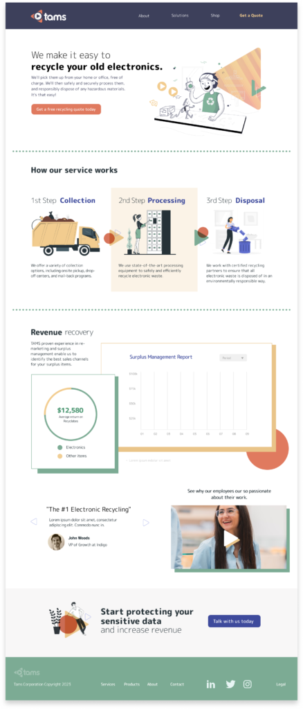
You can see in my design refresh I did just that.
I made the hero clean and the value prop clear. I added a fun illustration and utilized shapes from the logo mark it increase branding.

Here are some specific details about the changes I made:
- The Services section now includes an interactive carousel that walks users through the process of using our services. This makes it easier for users to understand what we do and how we can help them.
- The Revenue section now uses mock UI to show potential ROI for our services. This helps users visualize the benefits of working with us.
- The copy throughout the website is now larger and more legible. This makes it easier for users to read and understand the information on our website.
- The font in headings now matches the logo font. This helps to create a more cohesive and professional look for our website.
- The Social Proof section now features customer quotes and an employee testimonial video. This helps to build trust and credibility with our users.
- Finishing up with a clear CTA and a cleanup up footer.
I believe that these changes have made our website more user-friendly and informative.


