Glen Gunnell

Breathing New Life into a Relic:

The Investor Relations Website Rebranding Project

Why a Redesign?

To enhance the user experience and reflect nCino’s updated brand identity. The Investor Relations site is in the process of a refresh.

My Role

As the Website UX and Visual Designer for the Investor Relations subdomain redesign, I spearheaded the application of nCino’s updated web design system. I served as the central point of contact for design exploration and creation, collaborating closely with legal, branding, marketing, and third-party developers to ensure a seamless and on-brand user experience.

Goals

The nCino Investor Relations subdomain redesign has two key goals in mind:

  • Enhanced Brand Alignment: Ensure the subdomain’s visual identity seamlessly reflects nCino’s updated branding, fostering a consistent and professional experience for investors.
  • Improved User Experience: Optimize the Website’s usability to make it easier for investors to find the information they need, leading to a more engaging and informative experience.
Key UI Updates

Color Palette:
While the primary brand colors remained consistent, we incorporated a range of tonal hues to soften the overall palette and create a more sophisticated aesthetic.

UI Elements: 
Buttons, search bars, form fields, and other UI elements were updated to reflect nCino’s modern design system. This refresh prioritizes usability and provides a more intuitive user experience.

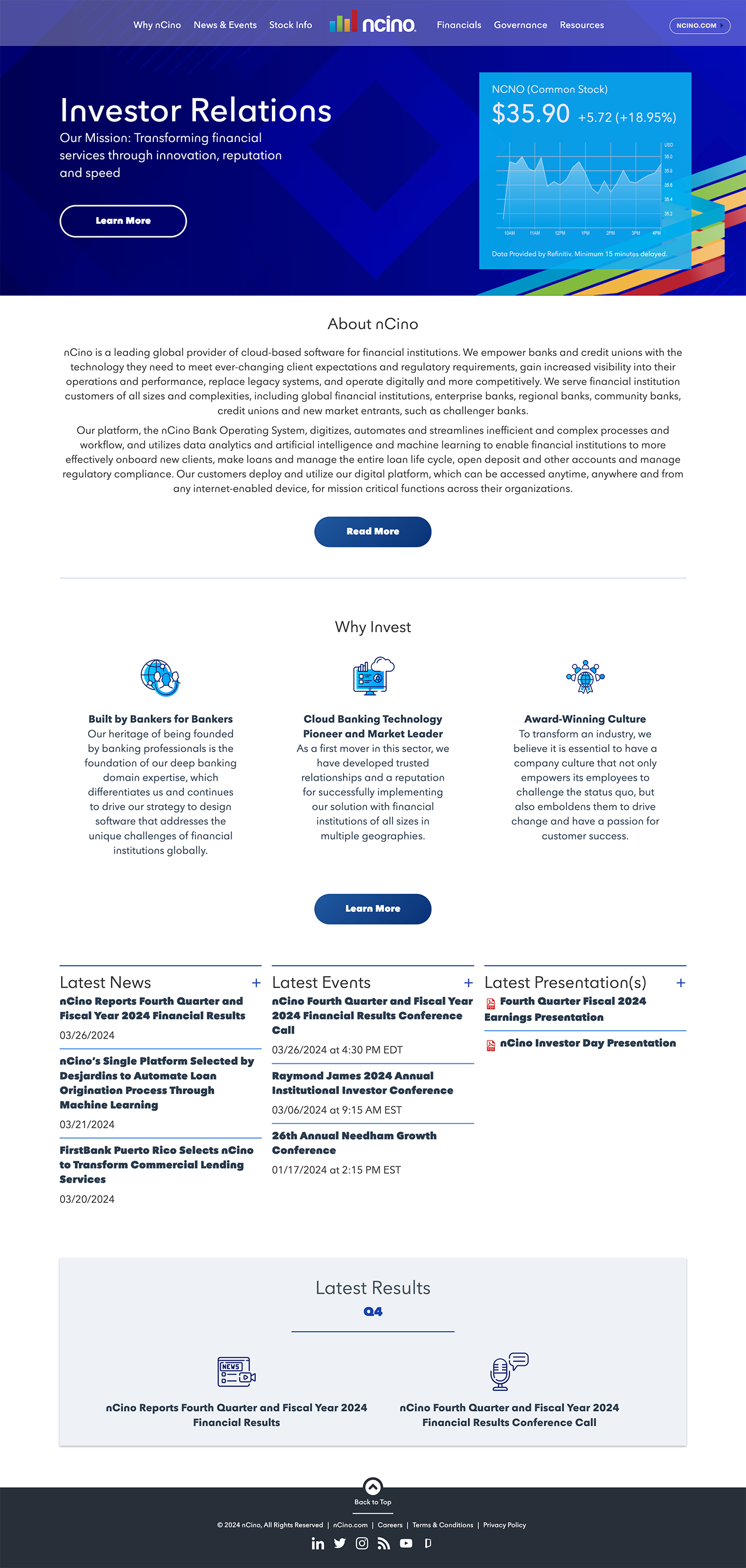
Centered text disrupts
natural reading flow.

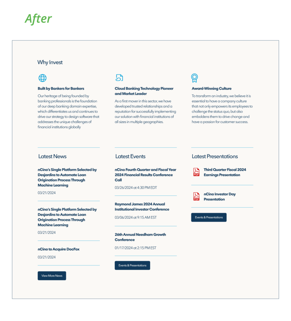
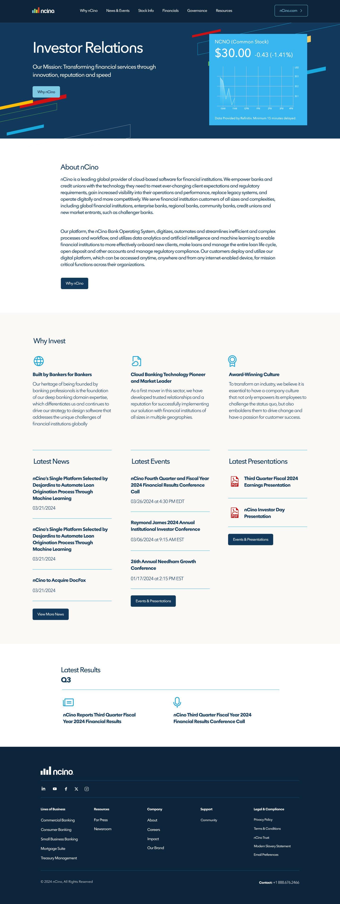
Effective spacing improves reading &
scan-ability for the user.

Spacing, Hierarchy, and Alignment: 
A grid system was implemented to ensure consistent and visually pleasing alignment of all page elements. Additionally, each element has appropriate spacing for optimal readability and clear visual hierarchy.

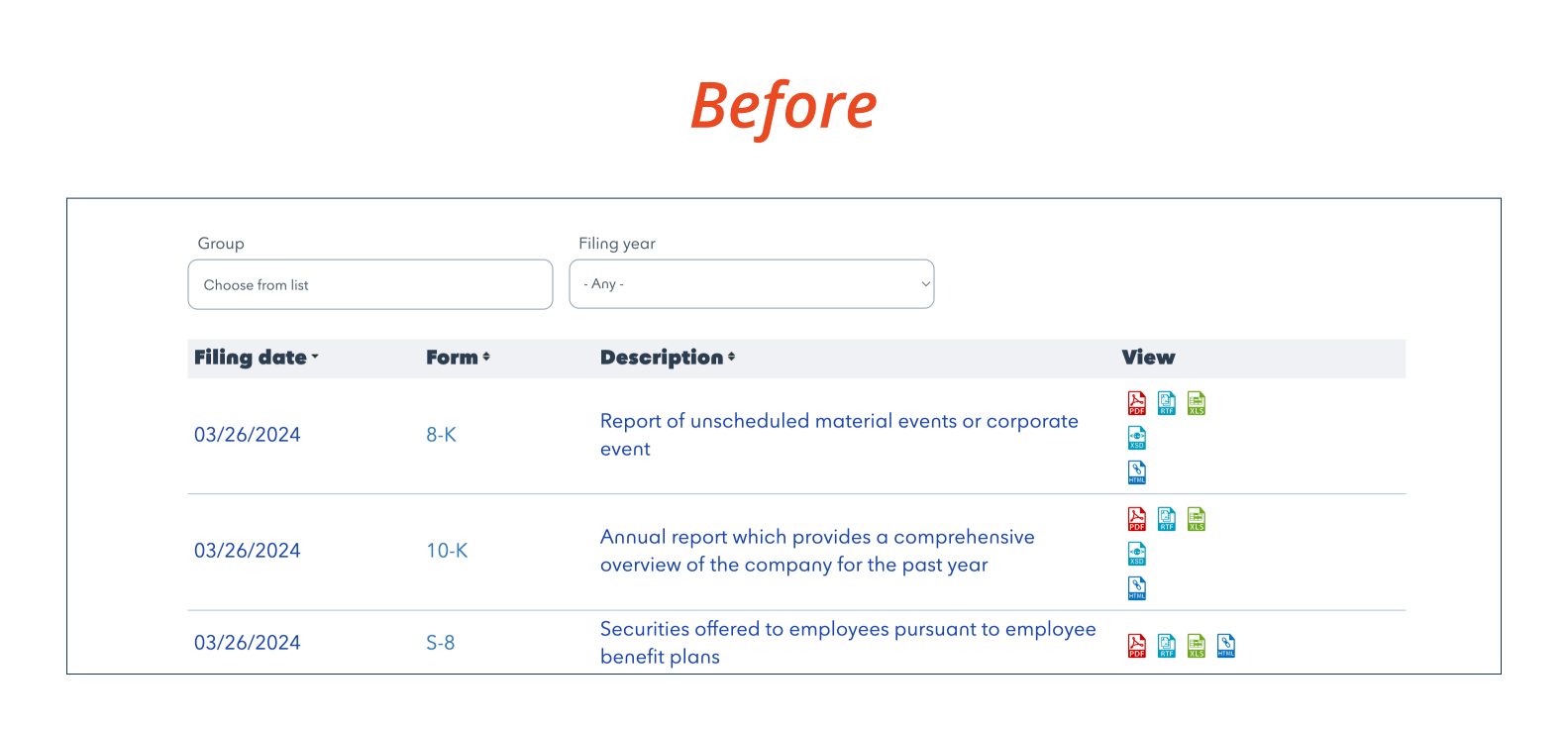
Font legibility issues
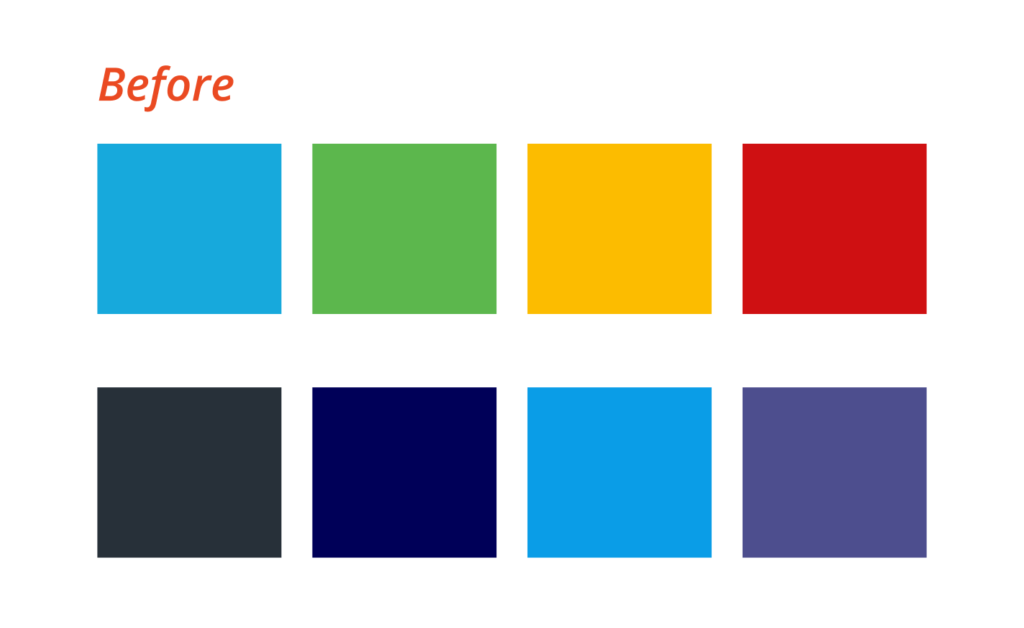
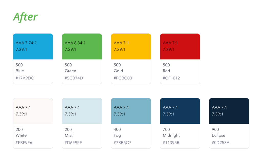
Off brand color

Small icons are hard
to identify

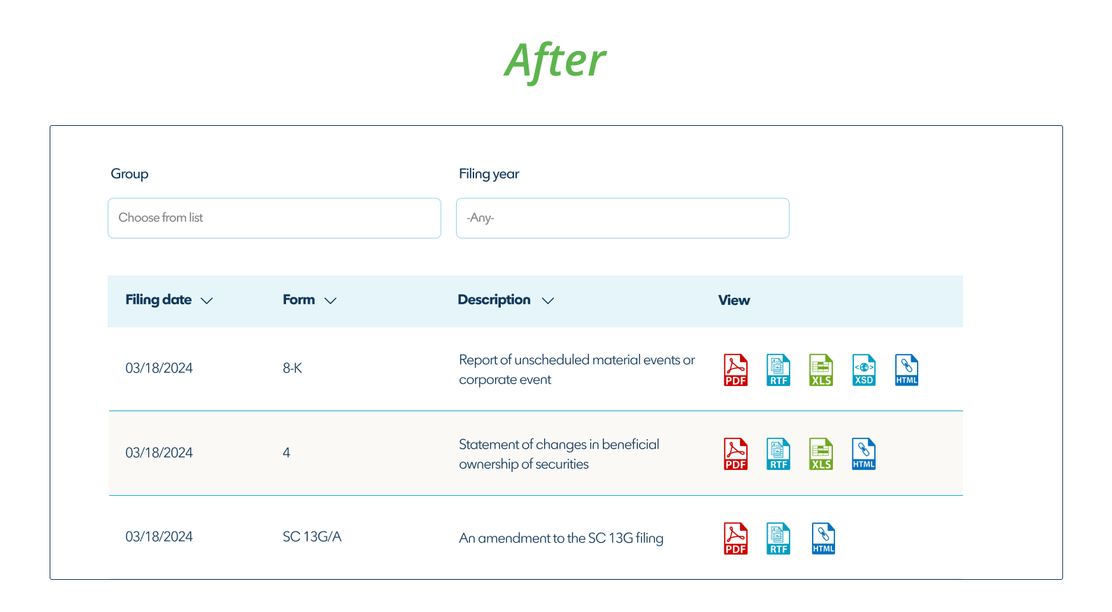
Font is more legible

Consistent rows, improved spacing

Icons are sized up for improved detection

Top Navigation: 
The previous design suffered from several shortcomings. The logo’s central placement felt outdated, the sub menu’s location appeared unconventional, and transparency was used in an unflattering way.

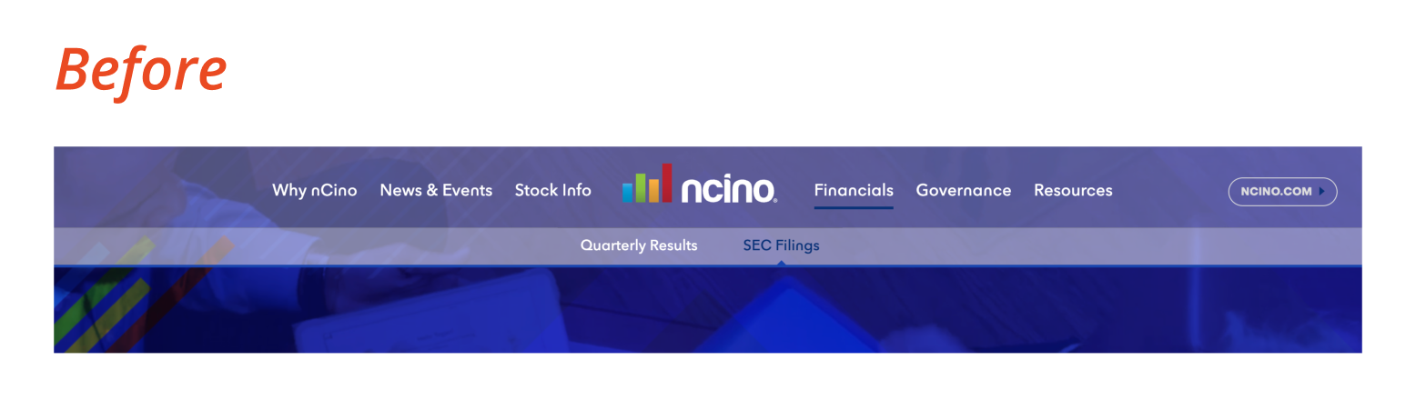
Outdated and low contrast navigation

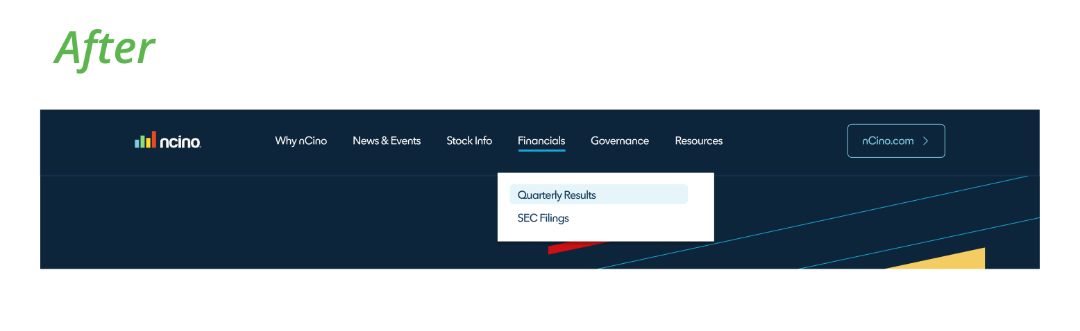
On-brand, clear navigation cues and improved contrast

Before
After
Investor Relations Proposed Home Page
Results and Next Steps
  • Launched: The site was smoothly launched and can be seen here https://investor.ncino.com/
  • Post-Launch Optimization: Following the launch, I will monitor key user metrics to evaluate the redesign’s effectiveness. Data-driven insights will be used to inform make improvements and ensure ongoing user satisfaction.