Introduction
The first thing that users see when they visit a website is typically a hero section. This is a great opportunity to communicate what the website is about and what users can expect. Unfortunately, many websites simply have a modern-looking splash screen with maybe a single button. This may not be enough to communicate what the website is about or to guide users to the information they need. I found two Websites that are needing help with the introduction to the navigation to the Information architecture to the overall visual design.
TL/DR – Watch the video
keeleycompanies.com
This website is mostly just a modern splash screen with a big picture and a quote in the hero. It is very minimal and is likely intended for those who are specifically interested in the company. Visitors are likely looking to learn more about the company, find a link to one of the three companies, or perhaps search for a career opportunity.
Here are some specific things that the website could do to improve the user experience:
- Provide more information about the company.
- Make it easier to find links to the three companies.
- Include a clear career CTA.
By making these changes, the website would improve the user experience and make it more informative and engaging.
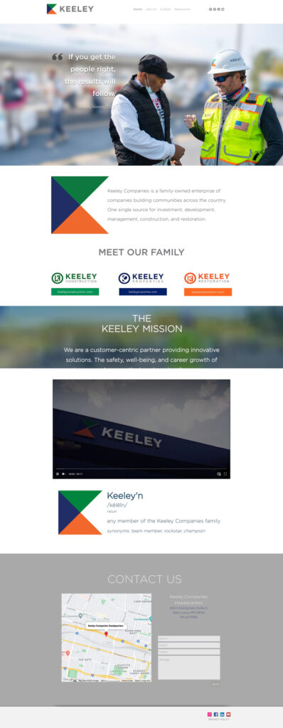
Changes that were made to the website
- The header was cleaned up by increasing the font size and moving the social links to the footer.
- The hero section was updated to address visitor goals more effectively. The quote was moved to a new “Careers” section.
- The “Careers” section includes a very clear call to action (CTA).
- The video now has a title so visitors know what they are going to watch.
- A triangle element was added throughout the website that harkens back to the logo mark and provides almost a table of contents.
- The overlay was removed from the photo.
- “Contact Us” was changed to “Connect with Keeley” with essential contact info and larger social media icons below.
- The spacing, font choice, and AI hierarchy were improved overall.
- A few things were consolidated and appropriated for mobile on the website.
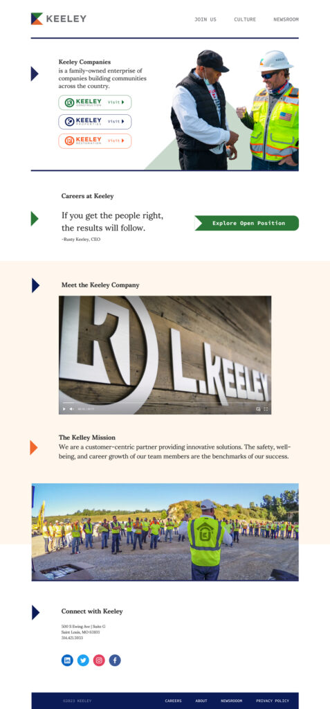
In conclusion, the website was updated to be more clean, professional, and user-friendly. The dark muted color scheme was kept, but it was refreshed to be more visually appealing. The website now has a clear purpose and is focused on how the company can help users achieve their goals.
The next website will be analyzed in the same way. It is important to remember that users don’t care how cool a company thinks it is. They want to know how that company can help them succeed or achieve their goals. Companies that focus on making users the hero will be the most successful.
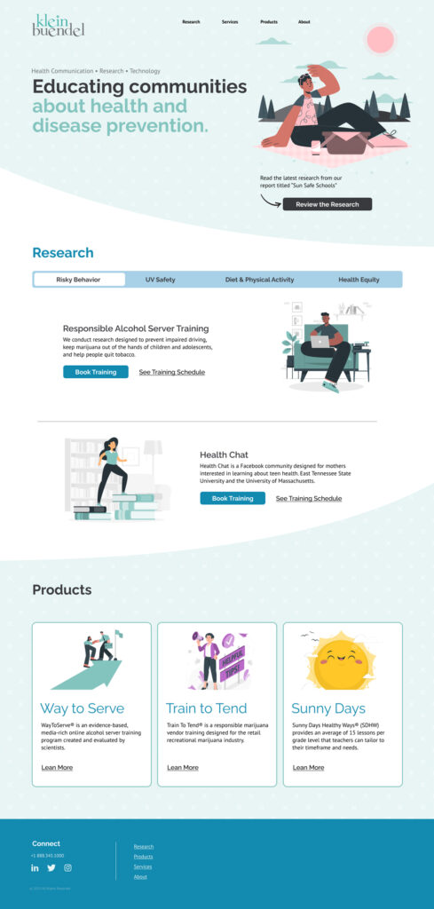
kleinbuendel.com
This website is set up like a vertical scrolling carousel with 2 horrid paragraphs in the hero sitting on a busy background. Carousels can be a great way to showcase a lot of information in a small space, but it can also be overwhelming and difficult to follow. This website has a general feeling of incompleteness and a major out=of-date feel. There are no clear calls to action, and it’s not always clear what the company does or what they offer. This can be frustrating for users, especially those with short attention spans.
Here are some suggestions for how the website could be improved:
- Add clear calls to action.
- Break up the content into smaller, more manageable chunks.
- Use clear and concise language.
- Use high-quality images avoid bad or generic stock photos and videos.
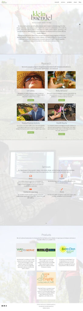
Clean Up
The hero section was cleaned up and now has a clear value prop in the headline. It also has a call to action that encourages users to explore a piece of content.
The research section was converted to an article type list where users can select different categories and explore the content. CTAs were added to each content piece to encourage users to take action.
The products section was tidied up and made more consistent. Logos were previously haphazard, I aligned them better with illustrations that belonged in the same brand. All of the text was formatted in a similar way.
The footer was cleaned up and made more clear. The links were organized in a logical way. Throughout the text is much easier to read.
On mobile, the research section was made into a user-activated carousel. This makes it easier for users to browse the content on their phones.
Overall, the website was improved by making it more user-friendly and engaging. The changes made the website easier to use and more likely to keep users engaged.
Conclusion
In conclusion, the website was improved by making it more user-friendly and engaging. The changes made the website easier to use and more likely to keep users engaged.
Here are some of the specific changes that were made:
- The color scheme was changed from green to pastels.
- Illustrations were used instead of stock photos.
- The Products section was simplified.
- A clear value prop was added to the hero section.
- CTAs were added to the research section.
- The footer was cleaned up and made more clear.
- The research section was made into a user-activated carousel on mobile.
Jacob Nielsen (Nielsen Norman Group) identified websites that have just a huge hero image above the fold are one of the Top 10 Web-Design Mistakes. Having only a single choice above the fold, maybe one button, is not good communication. As web designers, we can enhance usability by showing options and thinking through the user journey.