The NICA race app provides race information and race standings all-in-one.
Project duration
September 2023 to December 2023
Challenge: Streamline Race Information
NICA race info is split between 2 websites (details & results), creating a scattered experience. Both sites can be slow, frustrating users who need info fast.
Goals
Streamlined NICA Experience in One App (3 Months, Part-Time)
Prototype an app that is a one-stop shop for all NICA race information: Including race detail, race results, team and athlete standings.
My Role
UX designer, UX researcher
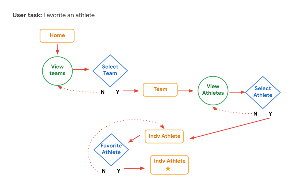
User Journey Map: Exploring the path to favorite an athlete.
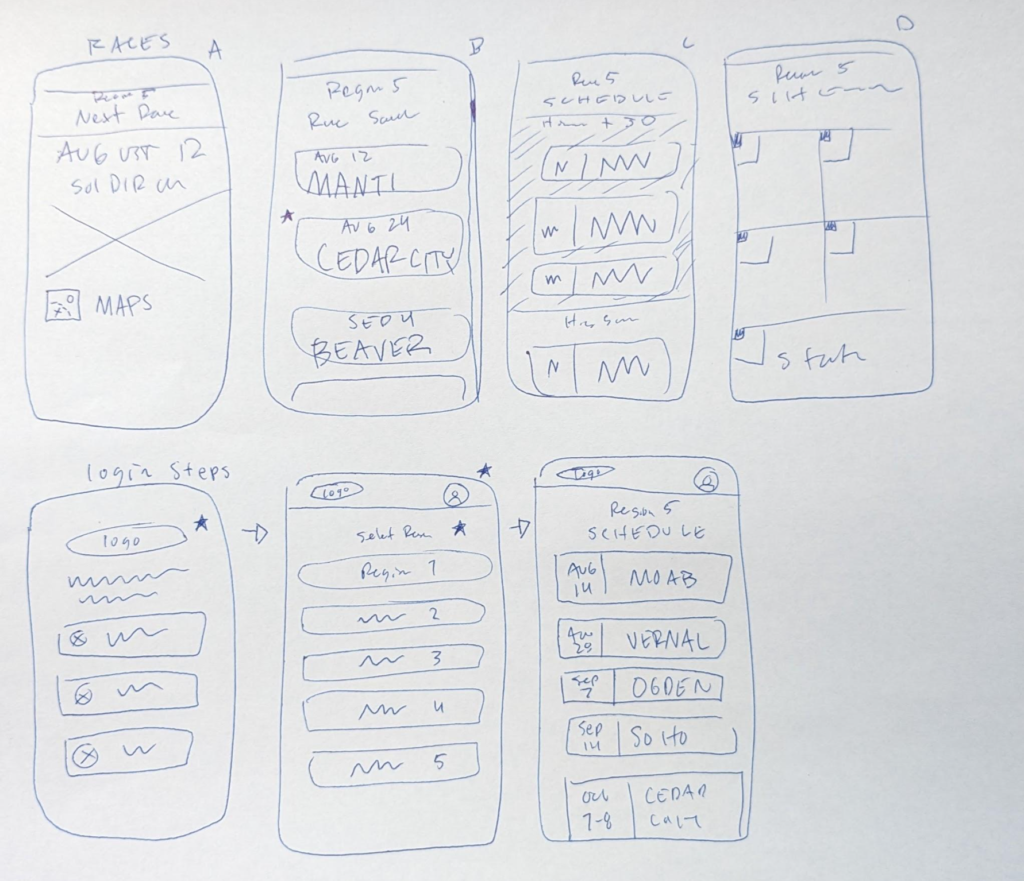
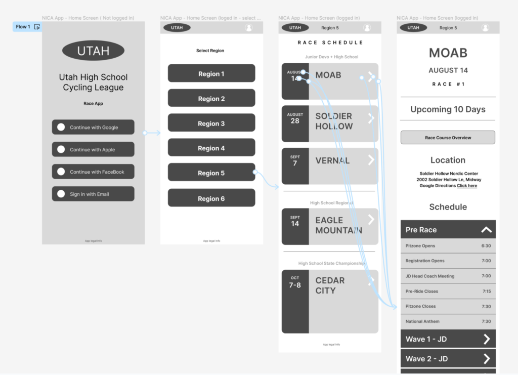
Paper Wireframes: Here’s a glimpse into the initial brainstorming for the race schedule overview and login pages. (Highlights the design aspect)
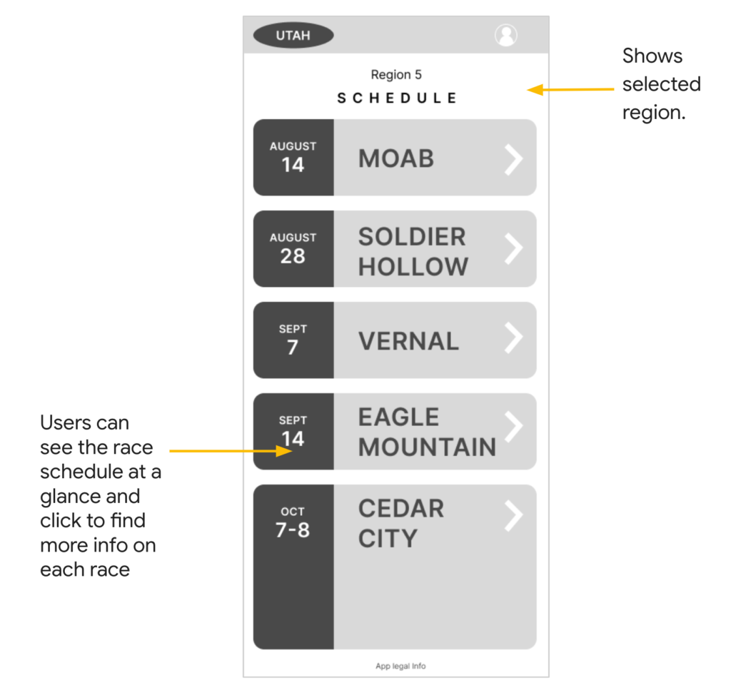
Digital Wireframes: This wireframe showcases Region 5’s race schedule in one location. All races for the season are displayed with clear information, including dates and locations.
Low-Fi Prototype: Prototyped core functionalities like login, region selection, and race event selection for the app’s MVP (Minimum Viable Product)
User research
Summary – NICA App Testing Success:
Two usability studies (one on a prototype, one on a refined mockup) with active NICA parents and athletes revealed strong user preference for a unified app compared to separate websites.
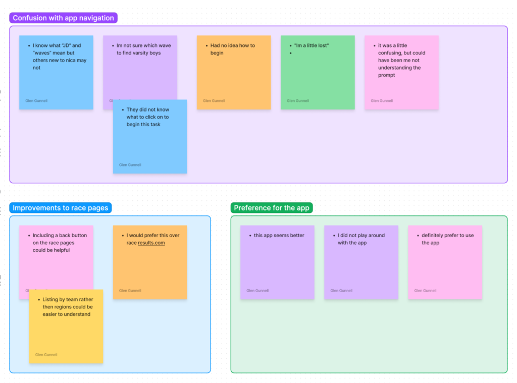
User Frustrations:
Scattered Information: Crucial race information is spread across multiple websites and documents, forcing users to navigate a confusing landscape of 3 separate sources to stay updated.
Data Redundancy: Websites often request data updates despite users already having downloaded race results, leading to unnecessary downloads and wasted time.
Inconsistent Design: Inconsistent user interfaces across different resources make it difficult for users to find what they’re looking for quickly and efficiently.
User Study Highlights:
Strong Demand for NICA App:
Participants overwhelmingly expressed a preference for the app over existing resources, with an average likelihood of use rating at 7.4 out of 10.
Quotes like “I definitely prefer to use the app” (Participant E) demonstrate enthusiasm for a unified platform.
Room for Improvement in Prototype Usability:
While all participants indicated potential app usage, the ease-of-use rating was 6.4 out of 10, highlighting the need for improvements.
Comments like “I’m a little lost” (Participant E) and instances where participants struggled to find the starting point suggest a lack of clarity in the prototype’s instructions or flow.
Based on Themes Identified:
Next steps were:
Refine the prototype’s user interface and instructions to enhance clarity and intuitiveness.
Improve user experience by eliminating jargon.
Refining the design
Mockups
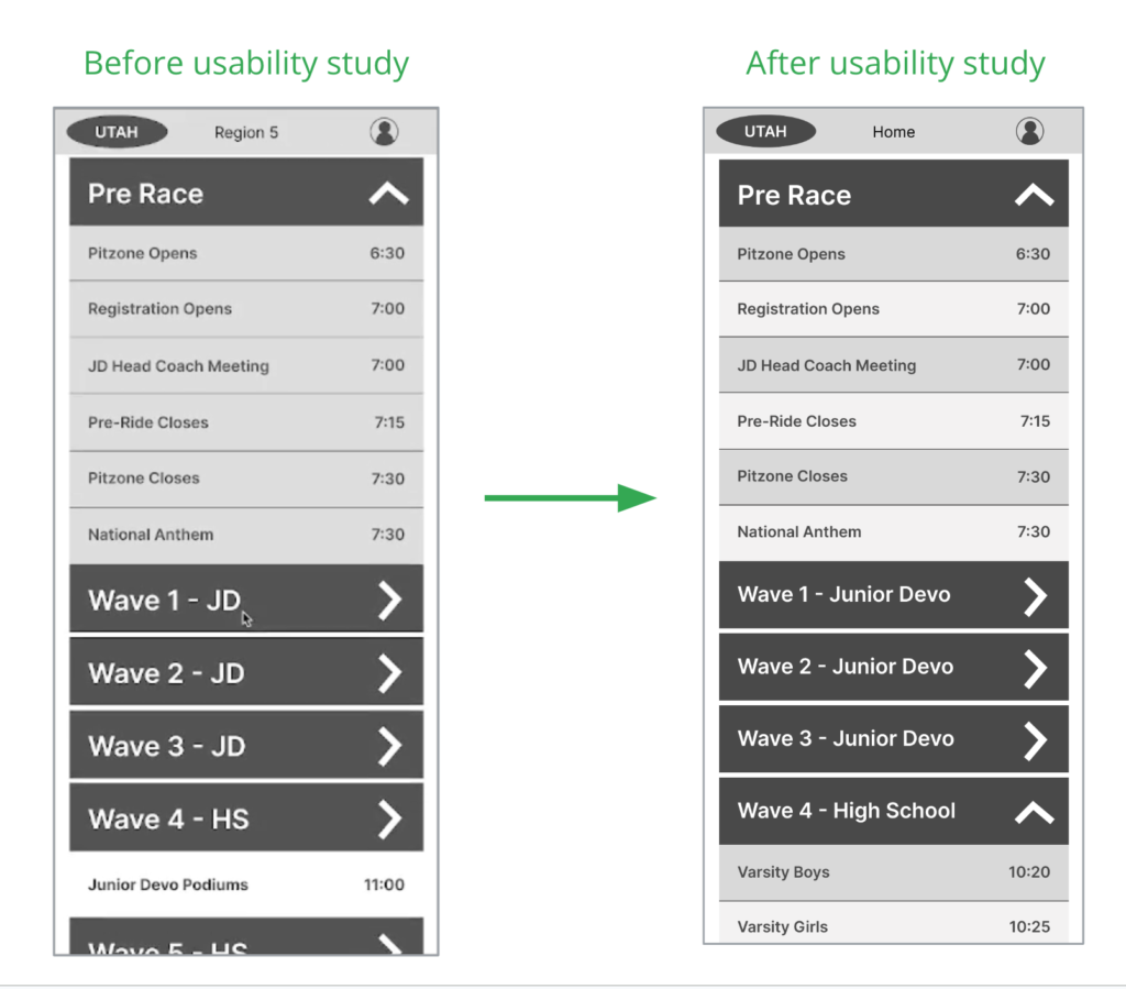
By implementing clearer navigation cues and eliminating jargon, these updates aim to significantly enhance user app preference.
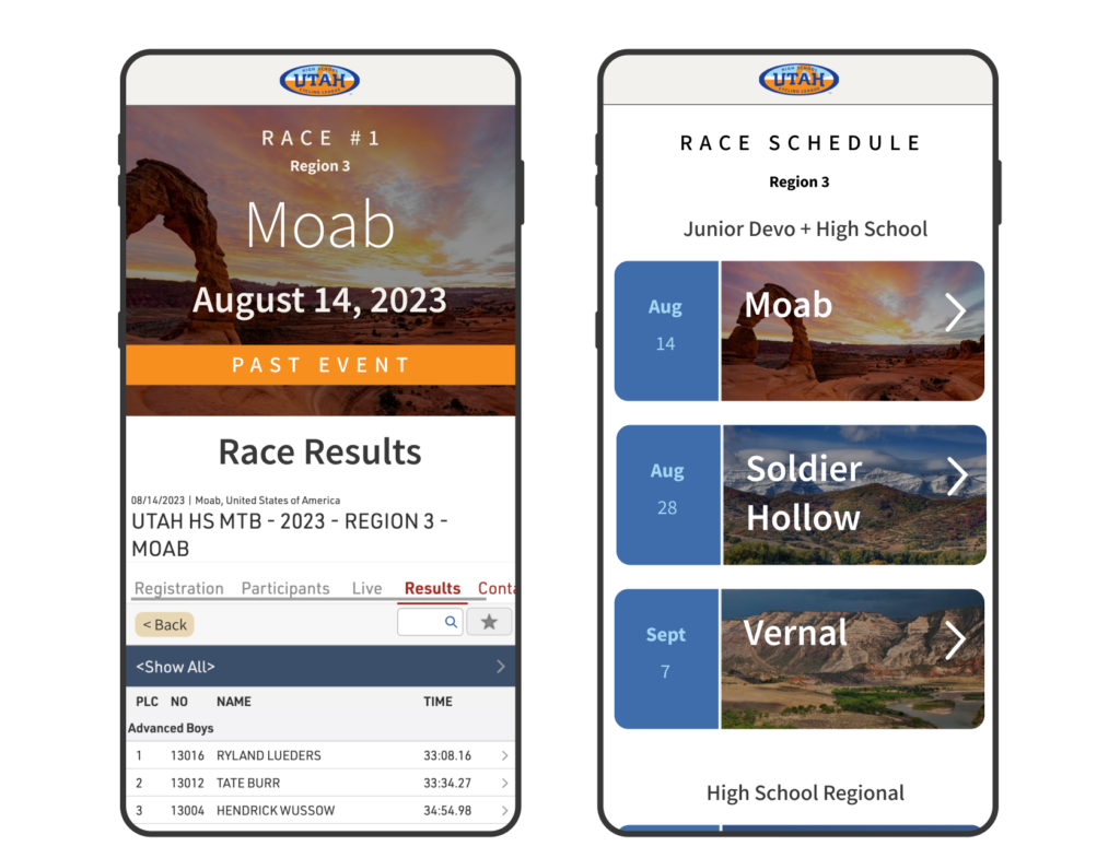
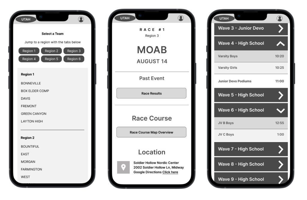
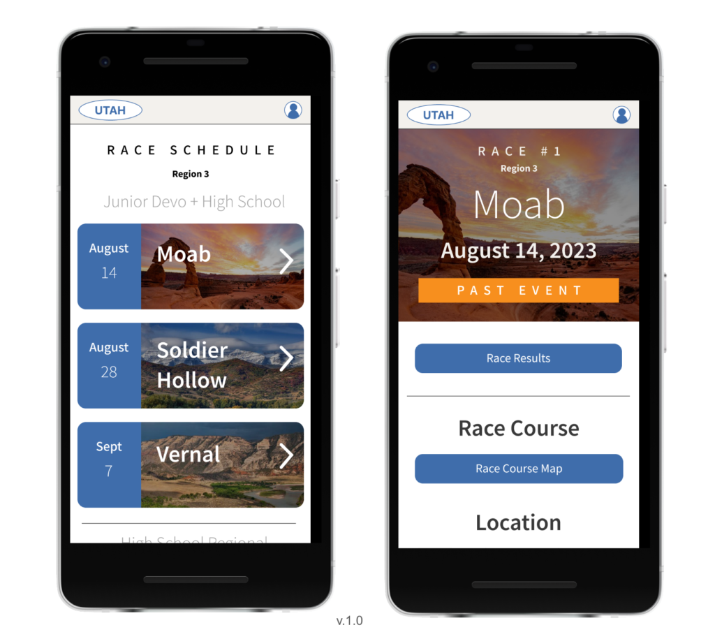
High-fidelity prototype
The high-fidelity prototype prioritized typography, color palette, layout, and icon design, creating a polished and user-friendly visual experience.
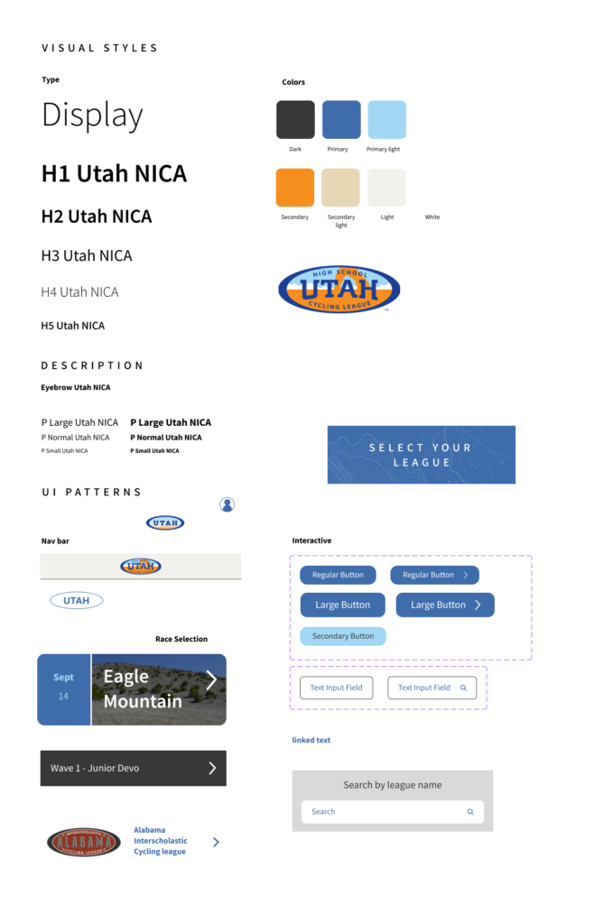
Design System Sticker
I developed a foundational design system sticker by exploring core elements like typography, color palette, and UI patterns. This system leverages the Utah colors as the primary and secondary palette, ensuring brand consistency across all interfaces.
Second Usability Study Findings
User Research Validates App Design:
Search is King: Contrary to expectations, user research revealed a heavy reliance on the search function. All five participants utilized it at least once, highlighting its importance.
Modern Design: Participants overwhelmingly favored the app’s clean and modern feel compared to existing website solutions. Comments like “I like the button design” and “It feels more intuitive” from Participant B exemplify this preference.
Efficiency Matters: The average task completion time of 40 seconds indicates efficient navigation and user experience within the app.
Going Forward
Key Takeaways
App Potential Validated: The user research strongly suggests the app concept is worth pursuing. Partnering with a sponsor or developer could make this a reality.
Enhanced Research Skills: Conducting these user studies significantly improved my understanding of user research methodologies.
Prototyping Expertise: Developing the prototypes for testing solidified my knowledge of the prototyping process.
Future Focus: This experience highlighted the value of thorough preparation for user research. Moving forward, I plan to anticipate diverse user scenarios to ensure even more effective testing.