Way to many Websites I see are way too similar in terms of their straight-up borings. Typically it is a result of things like usnig bad stock photos or videos, using bland color schemes. Poor font choices, un-inspiring content, no story, and/or no direction.
Here are some specific ways to make a website more interesting:
- Use bold colors and interesting typography.
- Use animation.
- Make the heading text huge.
- Use high-quality images and videos.
- Tell a story.
- Be creative.
Let’s dive into examples of before and after for each of these items.
1. Using bold colors and interesting typography.
Of course I could write a whole article just on color choices or typography. But for now here is an example of a typical web page that is bland in color choice and typography choice:

Here we have a section from the Apex Systems Website. Likely a benefits section. We will ignore the poor choice in stock photos for now and focus on the typography and color choices. As you can see there is not much thought in the font choices. They are Legible, there is a hierarchy but they are not particularly interesting. Colors are also very minimal, which can work, but when everything is rather minimal it’s very forgettable.
Let’s see what this section could look like with the use of a secondary font in the headings.
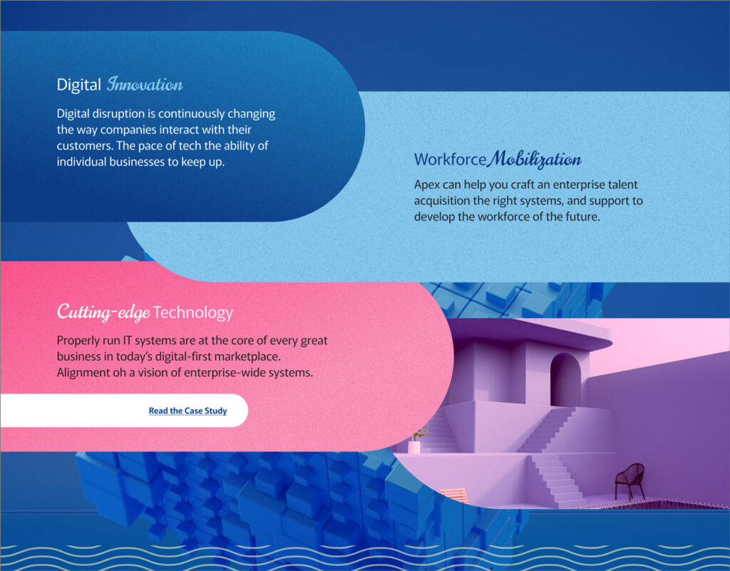
I tried a script font to highlight the benefit in each of the headings. Calling out “Innovation, Mobilization and Cutting-Edge Technology” If nothing else these are the scannable keywords that might stick with a visitor. This font is called Norcian. I also pulled in some ghostly neons in place of typical stock photos. the organic shapes help to make this more interesting. If I was building this Website I would consider animations to bring in the sections, and a short and specific CTA like “Read the latest Case Study”.
Using good color and typography choices will help to make any website stand out and be more visually appealing.
2. Use Animation.
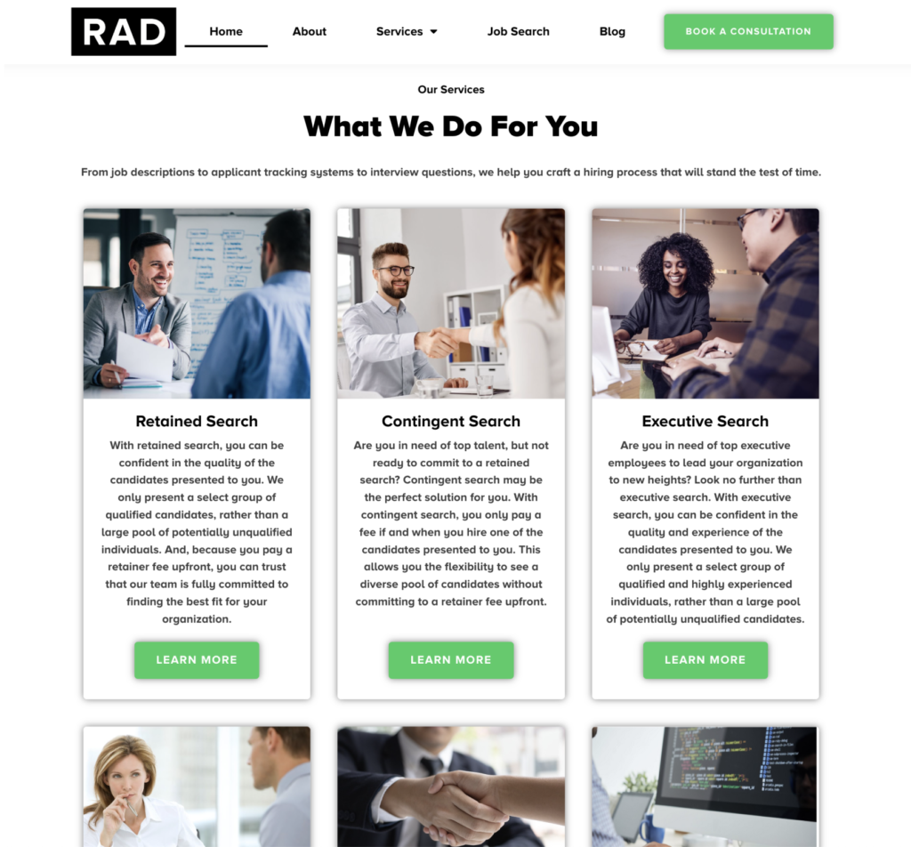
There are lot’s of ways to make use of animations in a Website. Audience and use of course will determine what is appropriate and what is distracting vs. delightful or engaging. First let’s look at an example of a section on the Website radhires.com. This “What we can do for you” or Service section is full of horrible stock photos, way too much text, bad shadows, padding, the list goes on. What if there was less text, no photos and instead a subtle engaging animation as the user scrolled or tabbed through each of these services?
Here is a gif animation of a possible solution. The navigation for this section anchors to the top of the page as the user scrolls. The navigation buttons also lead to each section. The CTA is also not competing with 3-5 other CTAs. The text is scannable and perhaps even legible. A much better solution that could be used to add interest and movement to this website.

Here is a nice example of motion on the scale.com Website. Animated keywords in the Hero heading rotate while an interesting 3D shape morphs on the side.

3. Make the Heading Text Huge
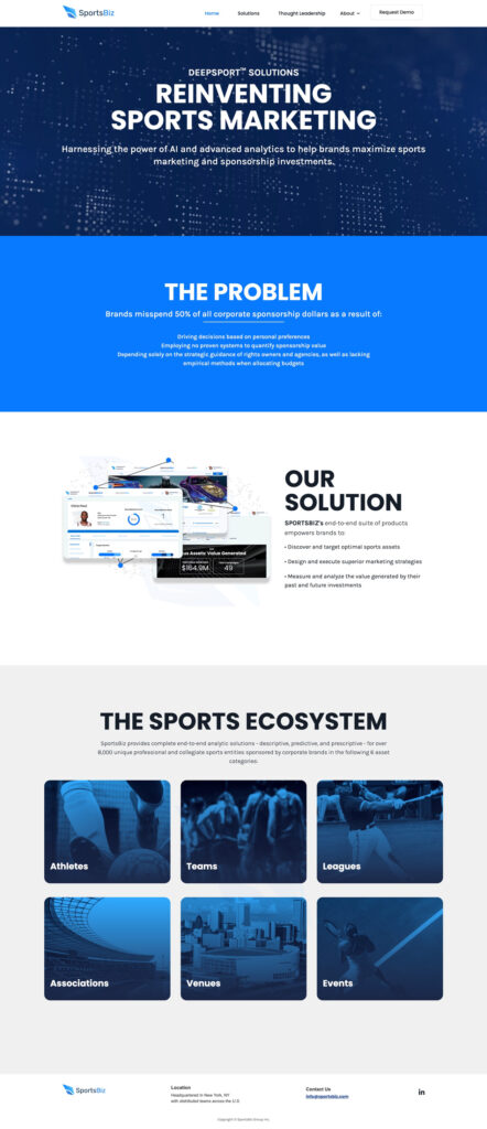
Another way to make your Website less-boring is to increase the text size of the most important text in the hero. This will help to grab attention and make the main benefit of your company or service obvious. But it does not have to stop with the hero, this tip could be used though out headings, as long as it is not over whelming. Sportsbiz.com Website does a good job at calling attention to the headlines with a large text size. And with only 3-4 main sections it works, it is scannable and I get a genral idea of what this company does just from reading the headlines.
4. Use high-quality images and videos
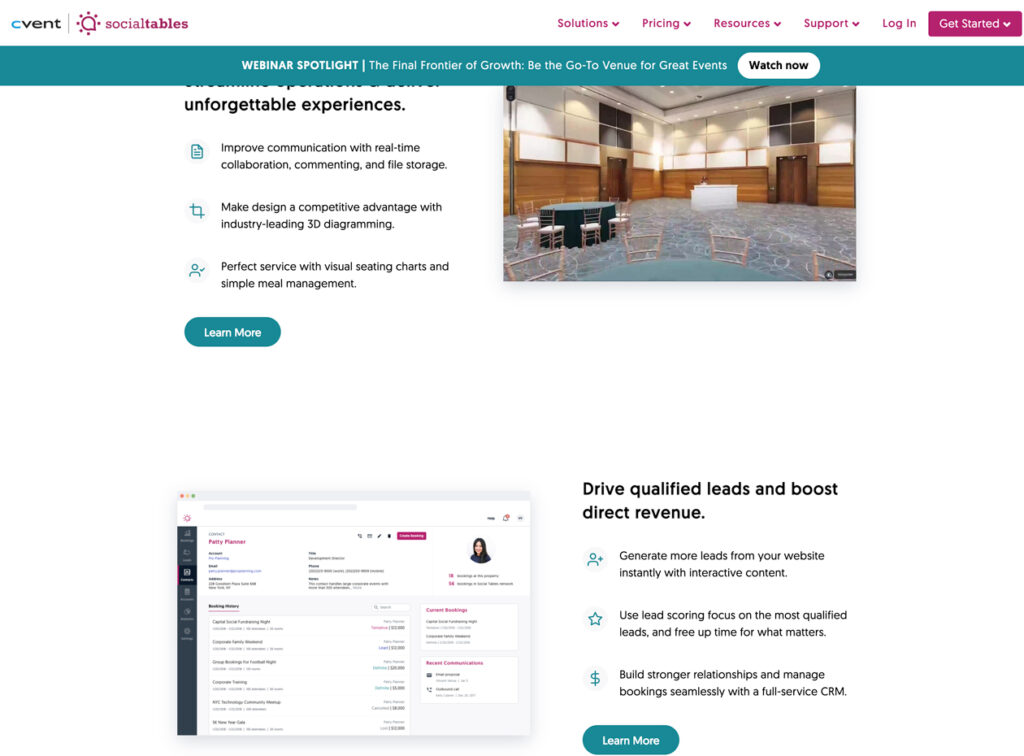
Using high-quality images and videos on your website can help to make it more visually appealing and engaging. These images can also help to tell a story, illustrate a point, or simply make your website more visually interesting. However, it is important to choose images that are relevant to your brand and that will not be perceived as cheesy or overused.
For example, the images on the RadHires website look like staged stock photos from six to eight years ago. They are not very visually appealing and do not do a good job of telling the story of the company. The images on the SocialTables website are also not very engaging. They are too boring and do not really help to tell the story of the product.
When choosing images for your website, it is important to keep the following tips in mind:
- Choose images that are high quality and relevant to your brand.
- Avoid cheesy or overused stock photos.
- Make sure the images are visually appealing and engaging.
- Use images that tell a story or illustrate a point.
- Make sure the images are the right size and format for your website.
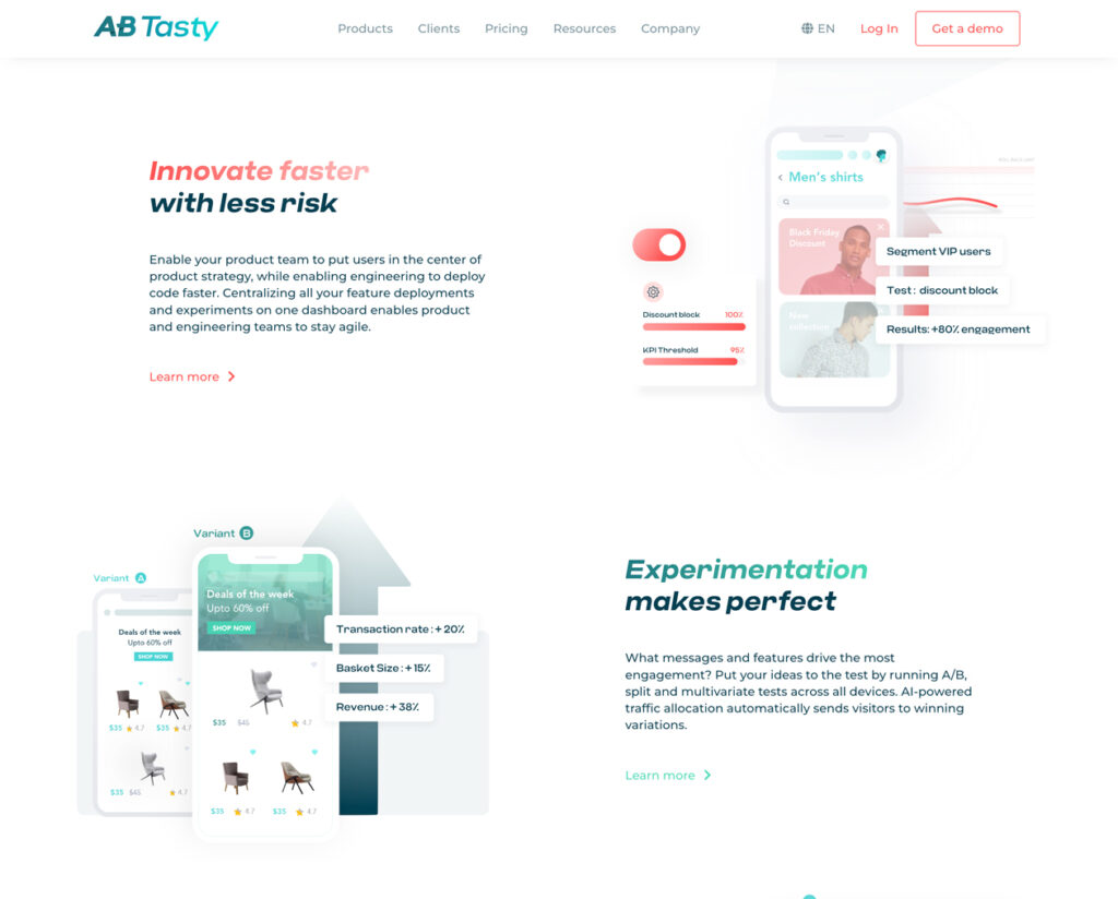
AB Tasty is a great example oof images that communicate well. The images are custom, on-brand and help to tell the story.
5. Tell a story
As in the example above telling story with images and any of the content will engage visitors and build trust. Using vivid language that feels personal and shows the character and voice of your brand feels more authentic. I am much more drawn to copy that feels like a person wrote it vs. a marketing conglomerate. Remember to keep it short and sweet. No one is reading massive paragraphs, visitors are scanning for answers or the next step to accomplish their goal. A strong call-to-action that avoids the ‘click her to learn more’ verbiage will always do better in conversion.
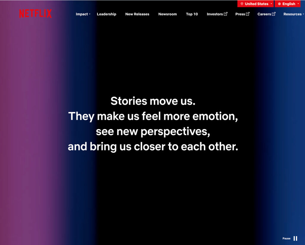
Netflix does a beautiful job of telling a story on their About us page. They begin with a full height sentence talking about what else but stories. They then move on to a more in-depth description and the Story of Netflix, a brief history of the company. They offer some featured content that fits into the brand a piece on culture, investor relations and careers. What I love is that they use iconic photos from their shows along the way, reminding you of who they are and what they do.
6. Be Creative
Easier said then done, especially when the Website is a design-by-commitee production. But I believe everyone has some creativity and it is a skill that can be built. Don’t be afraid to think outside the box and come up with something new and different. We all appreciate a creative experience vs. a bland or site that makes you think meh. It can be difficult to find the balance of relative and unique, often the VP or Marketing wants everything to be on point and lead teh user down a journey of conversion. But it is possible to be creative, relavant and even novel in story-telling and design.

Charma.com Website is a great example of a B2B that uses creative animations and fun illustrations to feel very creative and engaging. Using different techniques and formats can keep your visitors engaged. Whether it is video, CSS interactivity, Lottie animations, clever story-telling or any of the other items mentioned in this article.
By following these tips, you can make your website more interesting, engaging, and memorable.
